
Data-Explorer
Welcome to this guide to the Data-Explorer, your HAI-P200-4G controller’s native data visualisation tool. This tutorial shows you how to explore, analyse and compare the data collected by your Data-Plug through interactive, customisable charts.
Prerequisites
Section titled “Prerequisites”-
The HAI-P200-4G controller
-
HAI-OS
-
Variables already configured and collected through the Data-Plug
What is the Data-Explorer?
Section titled “What is the Data-Explorer?”The Data-Explorer is the data analysis interface built into HAI-OS. It connects directly to the Data-Plug’s local database (SQLite) and to the internal MQTT broker to give you a smooth view of your industrial equipment.
Its main strengths:
-
Two time scales: view your archives (Historical mode) or watch your machines in real time (Live mode).
-
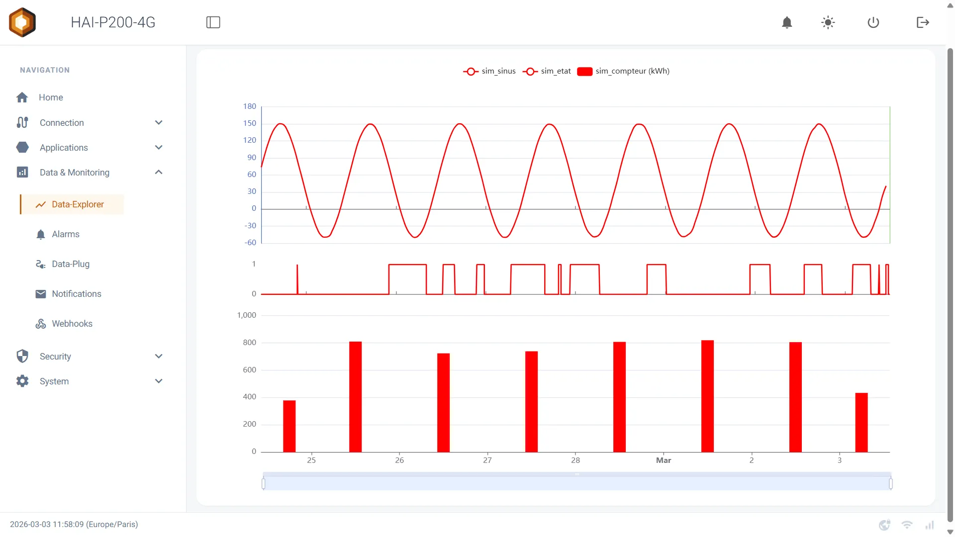
Contextual display: the Data-Explorer automatically adapts the chart type (line, bars, step) to the category of the variable as defined in the Data-Plug (Measure, Counter, State, Alarm).
-
Easy comparison: overlay your current data with the previous period in one click.
-
Batch analysis: open the chart already locked on the exact duration of a production batch, from the Batches page.
-
GPS tracks: position variables collected over NMEA 0183 are drawn on a map, historically as well as live, synchronised with the charts.
Configuring the charts (series)
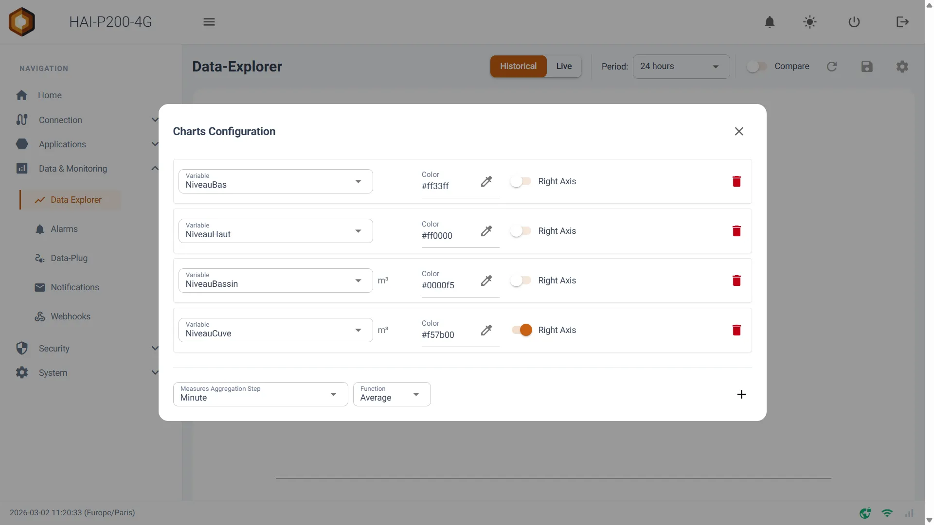
Section titled “Configuring the charts (series)”To start visualising your data, you have to define which variables to display. Click the gear icon (Settings) at the top right of the interface to open the Charts Configuration panel.
-
Click the Add button to add a new data series.
-
Variable: select the variable you want to plot from the dropdown. Its unit is shown automatically alongside.
-
Color: click the colour swatch to give this curve a specific shade on the chart.
-
Right Axis: if you are plotting variables with very different scales (a temperature of 20 °C and a pressure of 1500 mbar, say), turn this switch on. The curve then uses the scale on the right of the screen and stays readable.
-
Click the floppy disk icon (💾 Save) on the main page to store your dashboard.
Analysis modes: Historical & Live
Section titled “Analysis modes: Historical & Live”The Data-Explorer offers two operating modes, reachable through the main selector at the top of the page: Historical and Live.
1. Historical mode
Section titled “1. Historical mode”This mode queries the Data-Plug’s database to display past data.
-
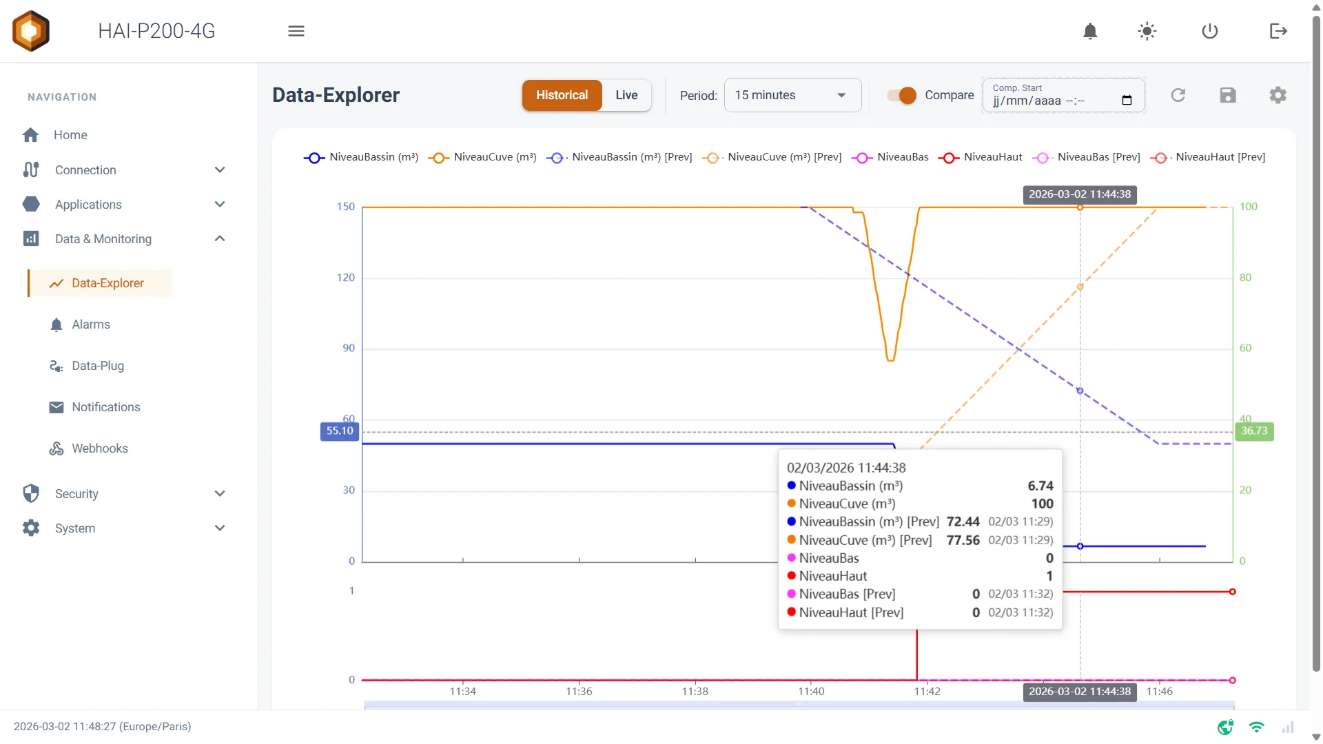
Period: choose a predefined time window (from 10 minutes to 6 months). The chart adjusts automatically.
-
Custom: selecting Custom in the period list brings up two calendar fields to set exact start and end dates.
-
Compare: turn this switch on to overlay the current period with the equivalent previous one (drawn as a dotted line). For example: if you are looking at the last 24 hours, Compare mode overlays the 24 hours before that. You can also set a manual comparison date.
2. Live mode
Section titled “2. Live mode”This mode connects straight to the MQTT broker to give you an ultra-fast, continuous refresh of your sensor values.
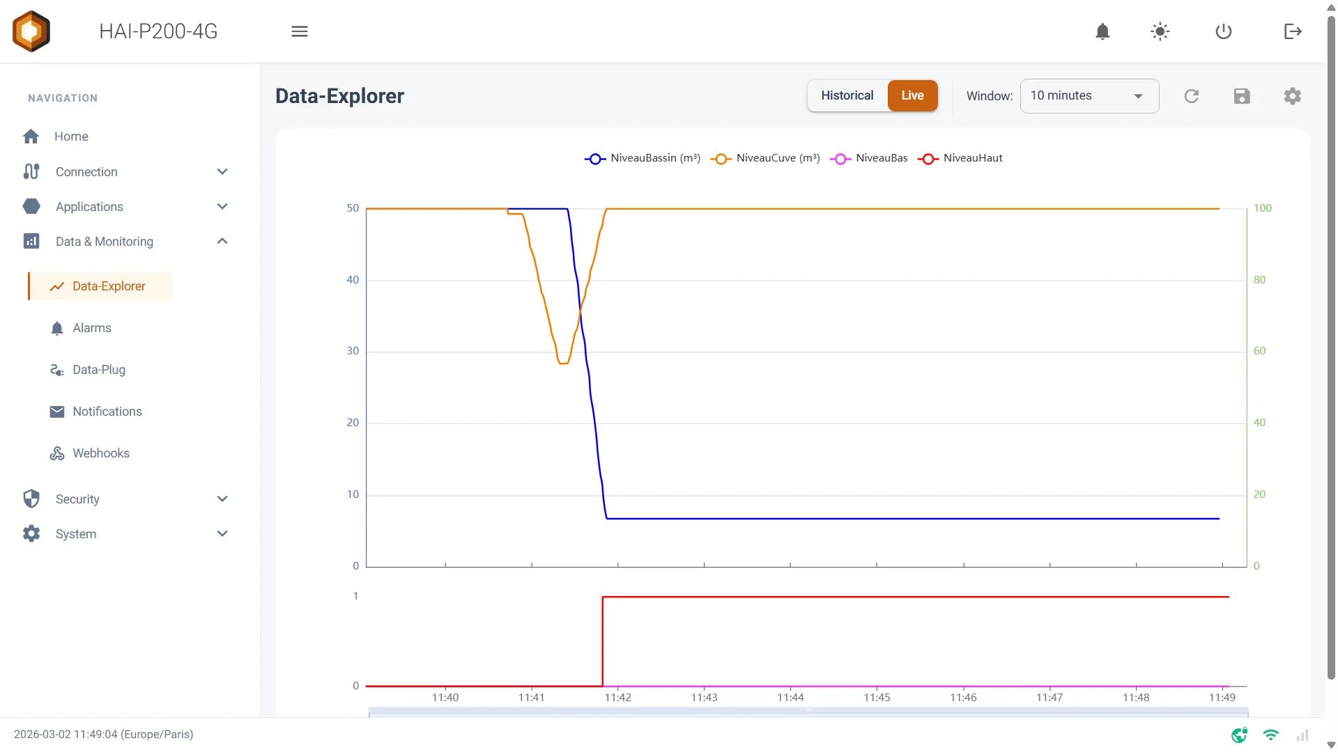
- Window: set the rolling duration shown on screen (the last minute, the last 10 minutes…). The chart scrolls by itself as new measurements arrive.
Smart display by category
Section titled “Smart display by category”The Data-Explorer’s visual behaviour follows directly from the Category you gave your variable when you created it in the Data-Plug. The system separates the drawing area sensibly, so that chart types are not mixed:
-
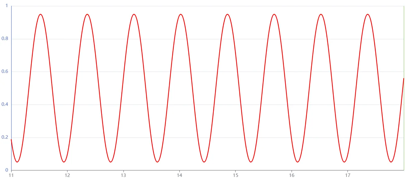
Measure category: shown as a classic smoothed line chart.
-
-
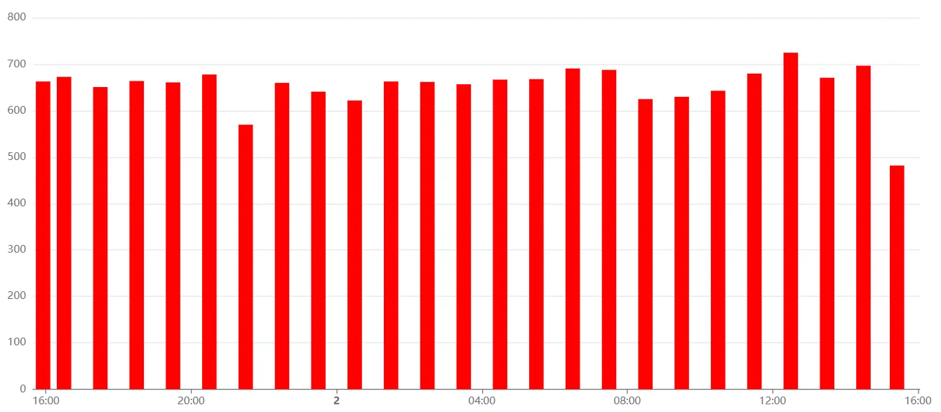
Counter category: shown as a bar chart representing the consumption over the given interval, in Historical mode. (Note: in Live mode, the counter is shown as a real-time progression curve.)
-
-
State and Alarm categories: shown as a step chart, ideal for seeing a machine’s state changes.
-

-
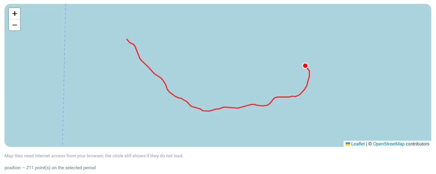
Position category: shown not in the chart but on a map, as a track joining the recorded points. See the Tracking a position on a map section.
-
Tracking a position on a map
Section titled “Tracking a position on a map”A variable in the Position category — declared in the Data-Plug on an NMEA 0183 navigation sentence — does not carry a numeric value but a GPS point. The Data-Explorer therefore shows it on a map, in a panel that appears below the chart as soon as a series of that kind is selected. You select it like any other variable, in the Charts Configuration panel, and the colour you choose becomes the colour of the track.
What the map shows
The path travelled over the displayed period, in the series’ colour. A legend below the map recalls the variable’s name and the number of points drawn — or tells you that no position was recorded over the period. Several tracks can coexist: each keeps its own colour.
Synchronised hovering
Hovering over the chart moves a marker on the map to where the equipment was at that instant, and the tooltip shows the corresponding latitude and longitude. The link works both ways: hovering over the track on the map moves the chart to the matching instant. If no position was recorded at that precise instant, nothing is shown rather than an approximate point.
Historical and live
In Historical mode, the track covers the selected period, and the points are spaced according to the measurement aggregation step (see Data aggregation): a long period gives a lighter track, without changing the path. In Live mode, the map fills in as positions arrive, point by point, with no aggregation.
Chart and map
The two coexist: numeric variables stay in the chart, positions go on the map. If your selection contains only positions, the chart disappears and only the map is shown.
Export
Position variables are included in the CSV export like the others, as a latitude/longitude pair.
Data aggregation
Section titled “Data aggregation”When you display long periods in Historical mode, the Data-Explorer automatically aggregates the data to keep the display fast and the chart readable.
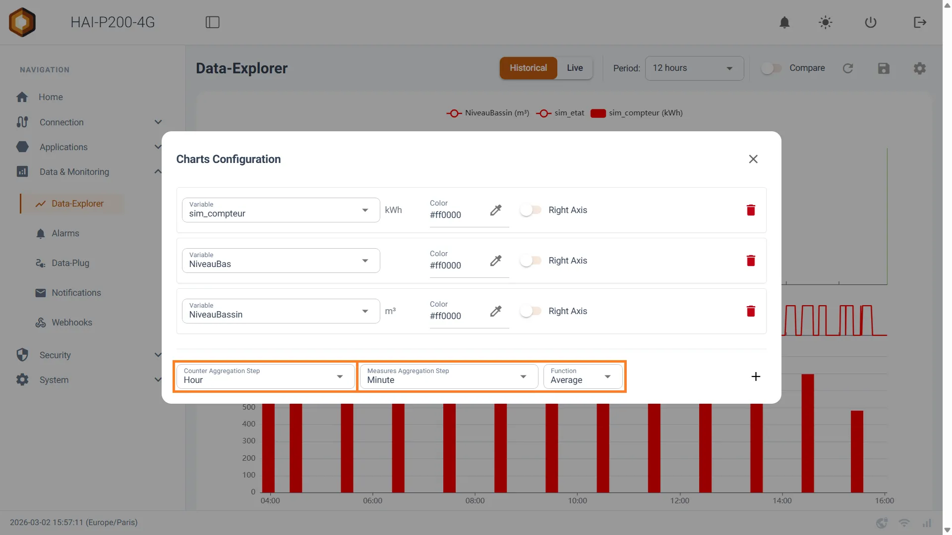
In the configuration panel (⚙️), you will find the aggregation section:
-
Measures Aggregation Step: sets the grouping step for measurements (Average per Minute, per Hour, per Day…). The system adjusts it automatically to the chosen period, but you can force it. That step also drives the spacing of the map’s points when positions are displayed.
-
Function: choose how measurements are summarised within that time step (Average, Min or Max). This field does not apply to positions — an average of coordinates would make no sense, and every point drawn is a genuinely measured one. It therefore disappears if your selection contains only positions.
-
Counter Aggregation Step: sets the calculation step for your counters’ consumption (per Hour, per Day…).
Exporting data (CSV)
Section titled “Exporting data (CSV)”CSV export (downloading the data) The Data-Explorer lets you download the raw data for the displayed period as a spreadsheet file.
-
How to do it: click the button with the download icon (📥) at the top right of the interface.
-
What is exported: the export produces a CSV file containing only the data of the selected variables, over the time period currently displayed on screen.
Analysing a production batch
Section titled “Analysing a production batch”From the Batches page, you can open the Data-Explorer already locked on the exact duration of a batch. The chart then carries a Time range locked on batch banner: the period is locked, and the time selectors and the comparison are disabled, to guarantee that you really are analysing the batch’s window. A button unlocks the range to resume free exploration, or takes you back to the batch list.
Guest access
Section titled “Guest access”The Data-Explorer is one of the pages that can be exposed in open access: your operators can consult the data, plot their curves and export them to CSV without a password, and without being able to alter the controller’s configuration. The only restriction specific to this page is that a chart configuration cannot be saved — the save button does not appear for a guest.
To enable it, see Guest access.