
Alarms
Welcome to this guide to the Alarms page. This module centralises the monitoring of your installation: it shows the state of your alerts and their trigger history, and includes a powerful Root Cause Analysis (RCA) tool to help you understand quickly where a fault came from.
Prerequisites
Section titled “Prerequisites”-
The HAI-P200-4G controller
-
HAI-OS
-
Tags already configured with the Alarm category in the Data-Plug.
Two viewing modes: Live & Historical
Section titled “Two viewing modes: Live & Historical”The alarm monitoring interface has two main modes, reachable through the switch at the top of the page.
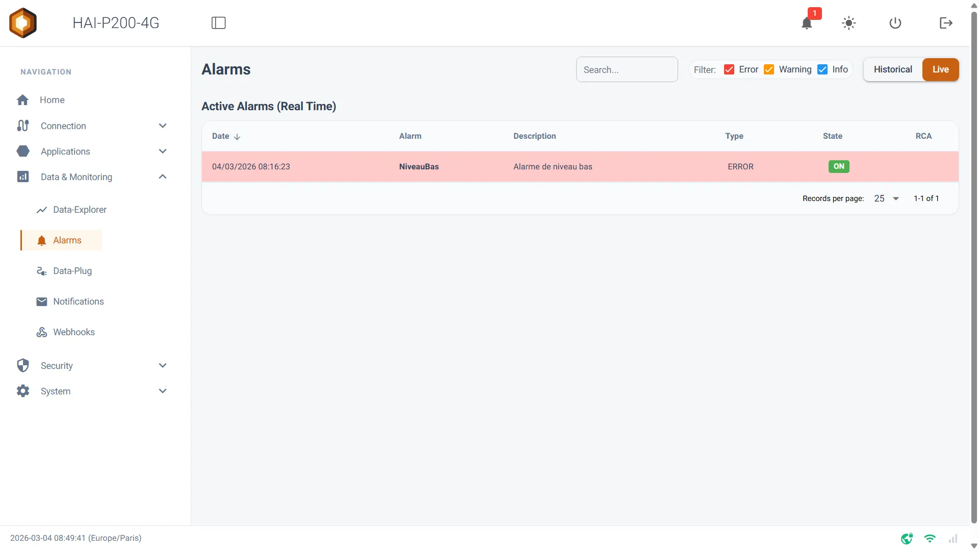
1. Live mode (real time)
Section titled “1. Live mode (real time)”This mode shows the alarms currently active on your system, as they happen.
-
It connects to the data stream (MQTT) in real time, for maximum responsiveness.
-
Only alarms in the ON state are listed. As soon as an alarm returns to normal (OFF), it disappears from this screen.
2. Historical mode (state transitions)
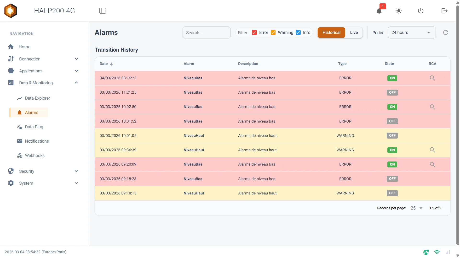
Section titled “2. Historical mode (state transitions)”This mode queries the controller’s database to retrace the history of state changes — OFF to ON, and back.
-
Period: a dropdown lets you select the time window to analyse, from the last 10 minutes up to the previous month.
-
Custom: selecting Custom lets you set a start and end date and time by hand.
-
Click the refresh button (🔄) to update the list for the chosen period.
Filtering and searching
Section titled “Filtering and searching”To help you navigate your data — especially during critical episodes that generate many alerts — the page offers quick filters:
-
Search bar: type a keyword to filter the table instantly on the alarm’s name or description.
-
Severity filters: tick or untick Error (red), Warning (orange) and Info (blue) to hide the events you are not interested in right now.
Built-in Root Cause Analysis (RCA)
Section titled “Built-in Root Cause Analysis (RCA)”This is the page’s flagship feature. When an alarm fires, it is often hard to tell which physical parameter — pressure, temperature, flow — caused it. The RCA tool automates that search.
In Historical mode, every event corresponding to an alarm trigger (a transition to ON) carries a magnifier button (🔍) in the RCA column.
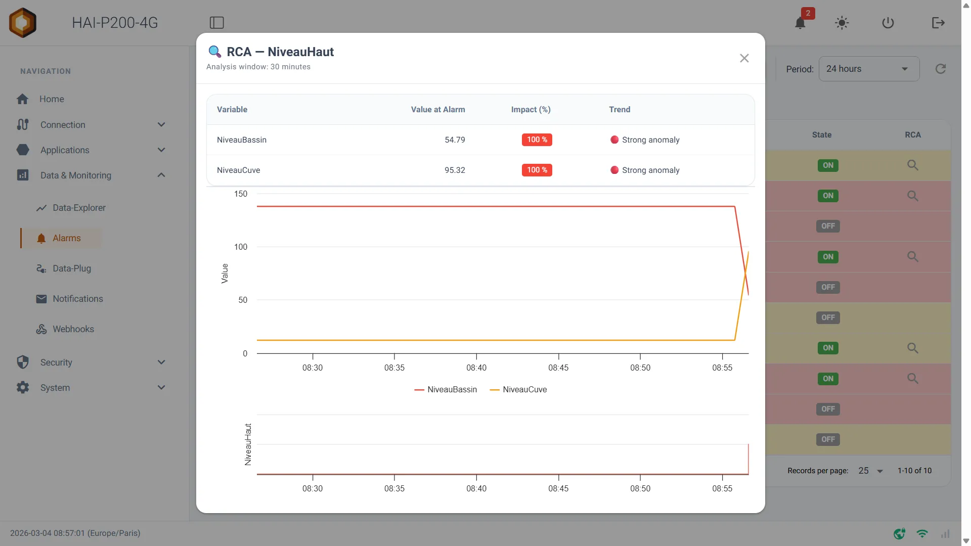
Clicking it opens an analysis window that computes the variations over the 30 minutes preceding the fault:
-
Top Impacted Variables: a table lists the top 5 tags of your system (Measure category) that showed the strongest abnormal variation just before the trigger. (Note: the system filters out background noise and only shows tags with an impact of 5% or more.) A trend is indicated for each (🔴 strong anomaly, 🟠 moderate anomaly, and so on).
-
Trend charts: an interactive chart plots the three most affected tags over that 30-minute window.
-
State chart: a step chart just below shows the exact moment the alarm switched to ON, letting you connect the behaviour of the measurements to the failure visually.
Guest access
Section titled “Guest access”The Alarms page is one of those that can be exposed in open access, without authentication. A guest gets every viewing feature described above: Live and Historical modes, filters, period selection and Root Cause Analysis.
To enable it, see Guest access.